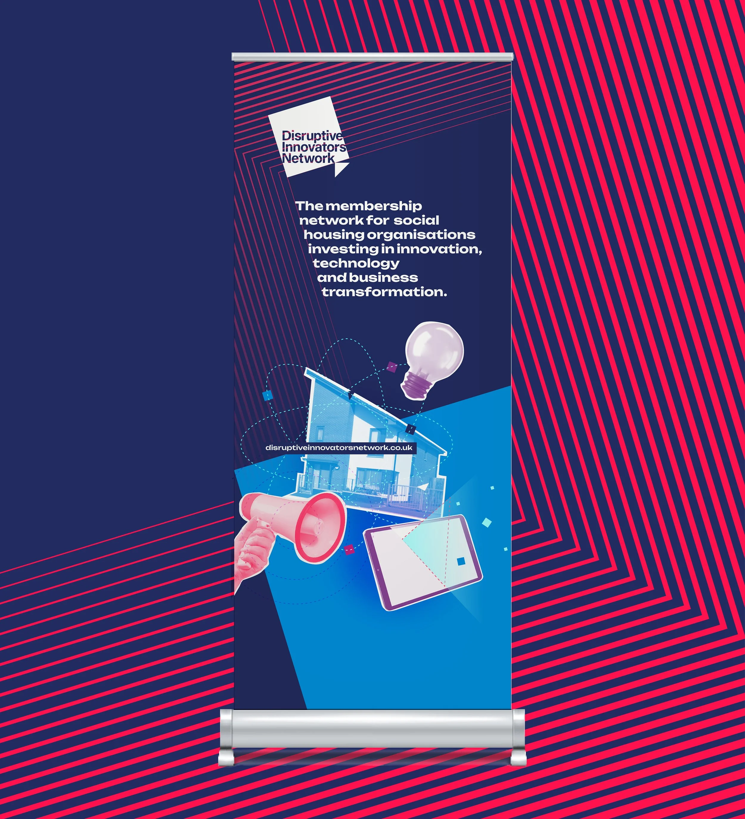
DIN
DIN, short for Disruptive Innovators Network, is a membership organisation for social housing innovation and development. The start-up brand was initially designed to have a simple, timeless look with the simple metaphor of the arrow pushing the solid square of its axis. The colours were corporate to give the brand a trustworthy and professional look.
Once established the task was to move the brand on to aid a membership push. The original logo was retained but a bold new design style was introduced to reflect the confidence and experience of the business. A broader colour palette was created along with a typeface with more quirk and personality. This reflects the character of the founders and also the subject matter that forms the brand offer. A simple, repeatable collage illustration style allows any complex subject to be visualised using duotone photography and simple icons and shapes.