Fabrick Group
Created at Gardiner Richardson
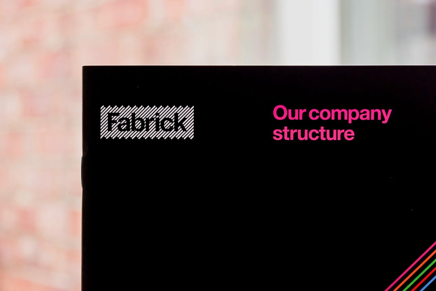
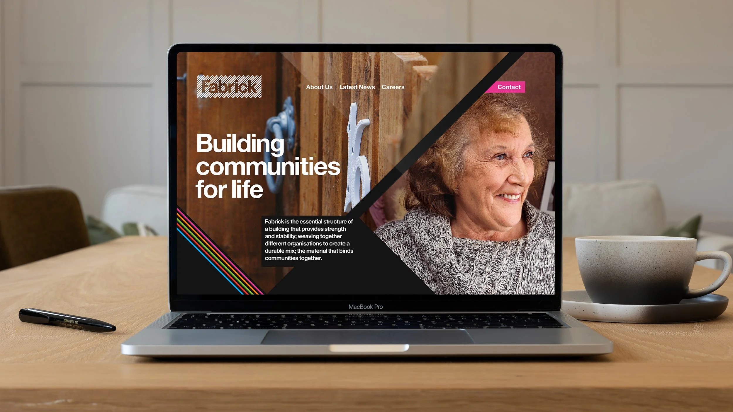
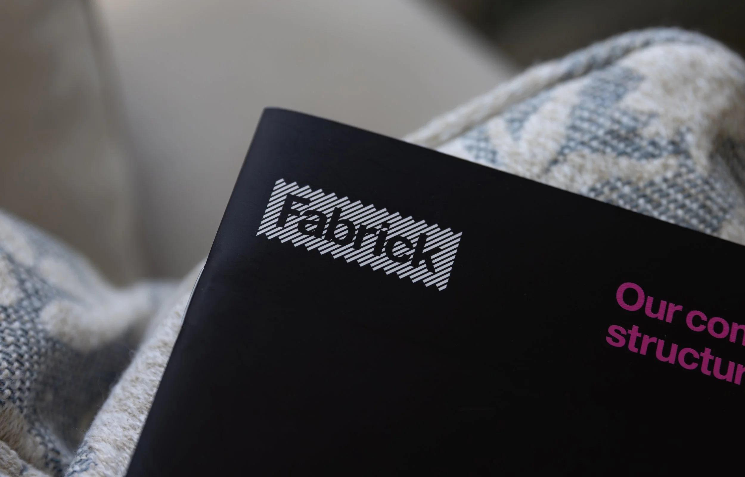
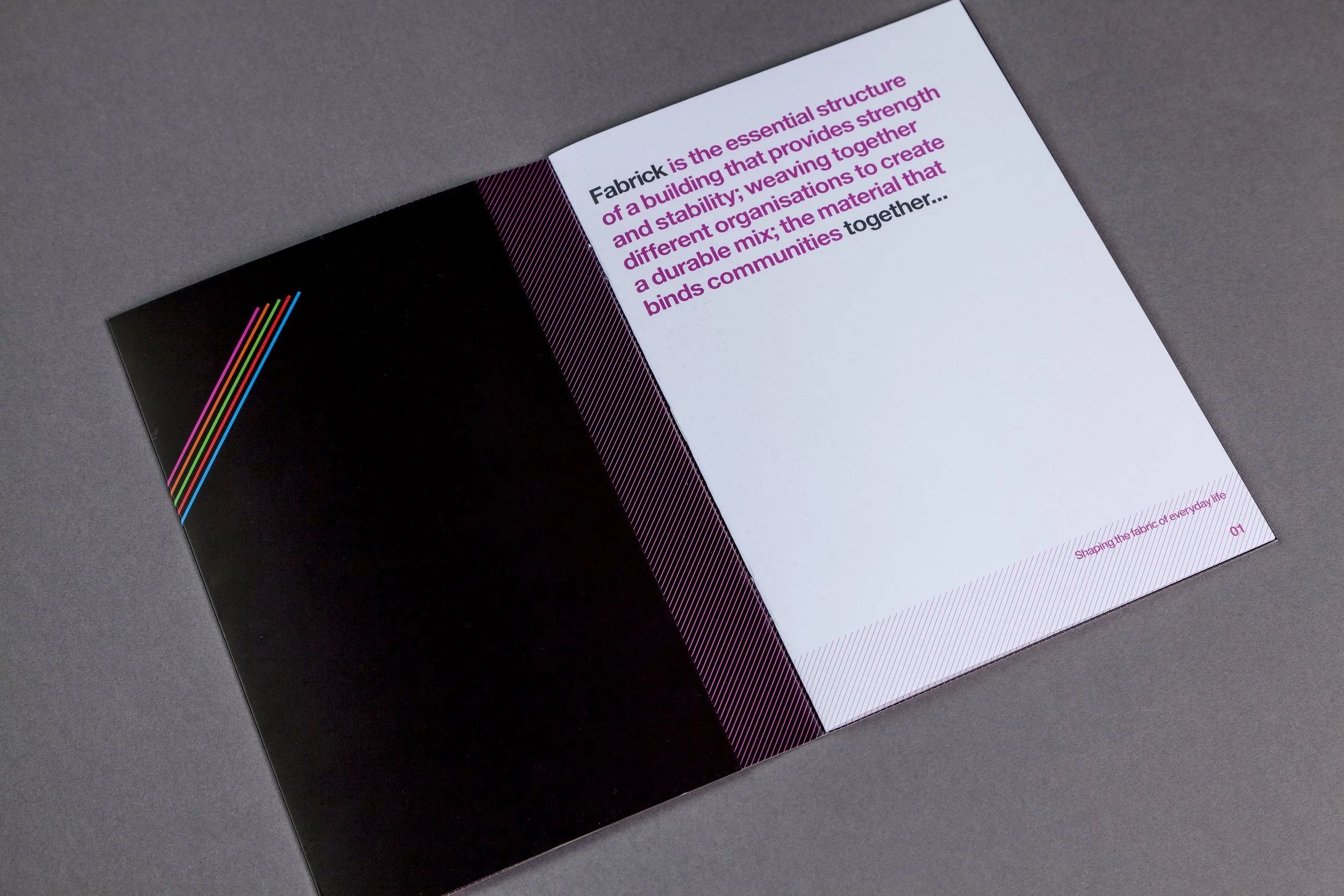
Fabrick Group was formed when two existing housing associations in North Yorkshire joined forces. The parent brand needed a name and identity that would represent the joint aims and ethos of the previous businesses and provide a platform to grow the new entity. The name Fabrick was chosen as a representation of the ‘entwining’ of the previous brands, and as the goal of being genuinely intrinsic in the community… ‘part of the fabric’.
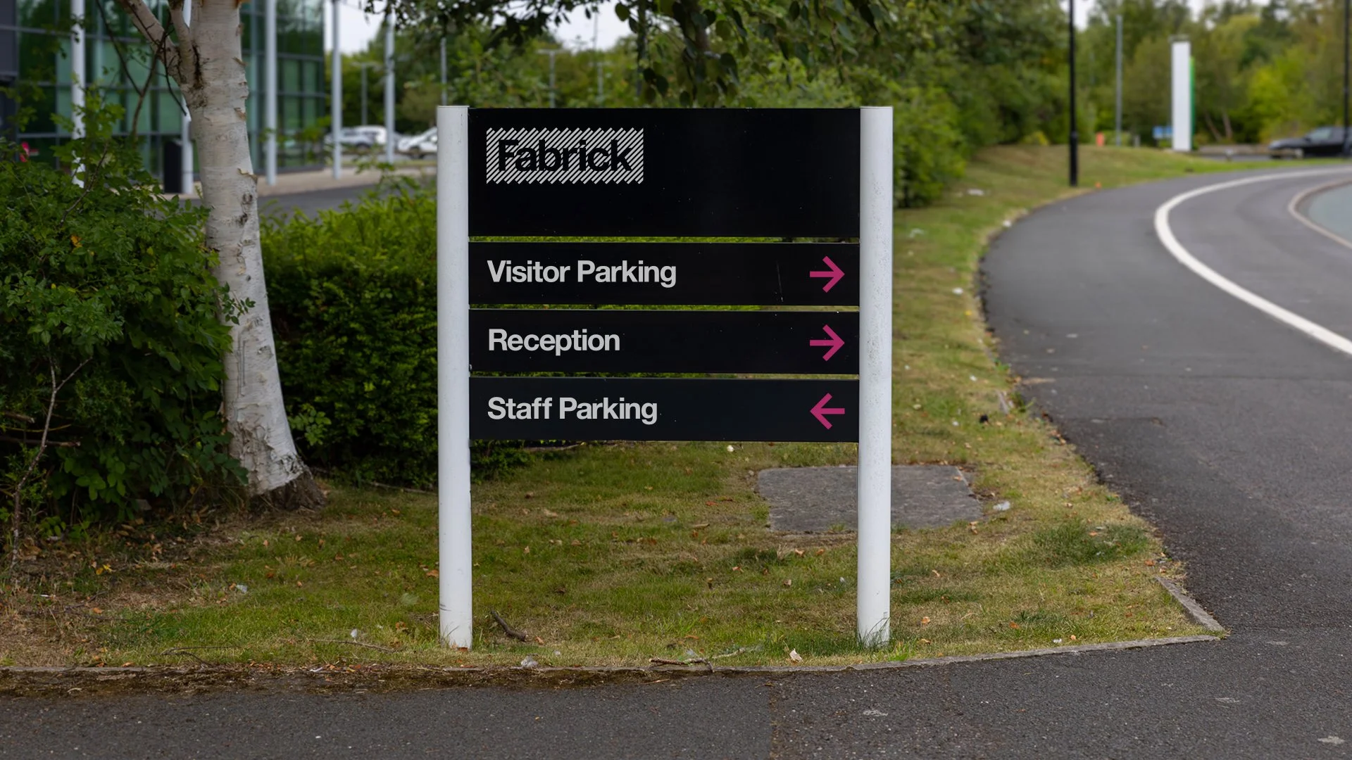
The extra ‘k’ provided a uniqeness and also, handily spelt out the word brick at the end! The visual identity was designed to appear as a ‘brick’ like shape drawn from an angled pattern with the lettering appearing in the negative space.

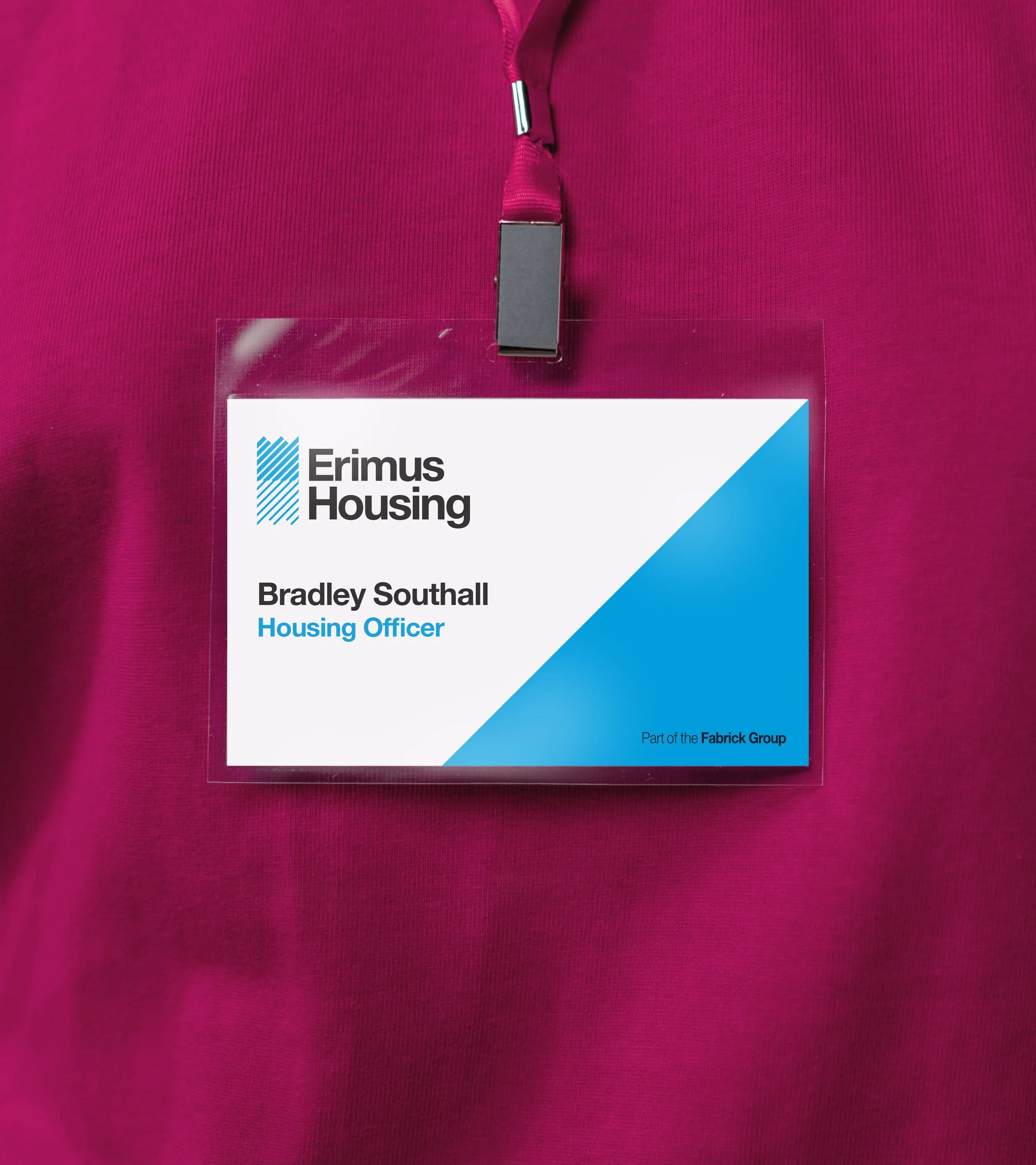
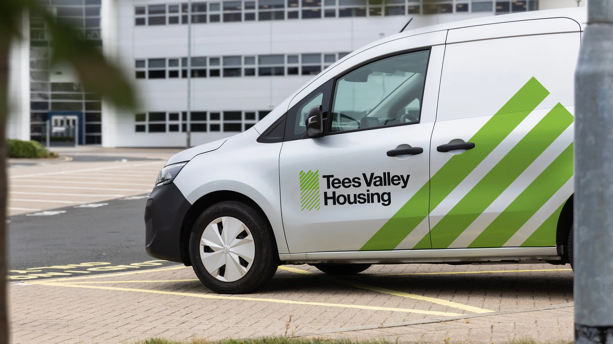
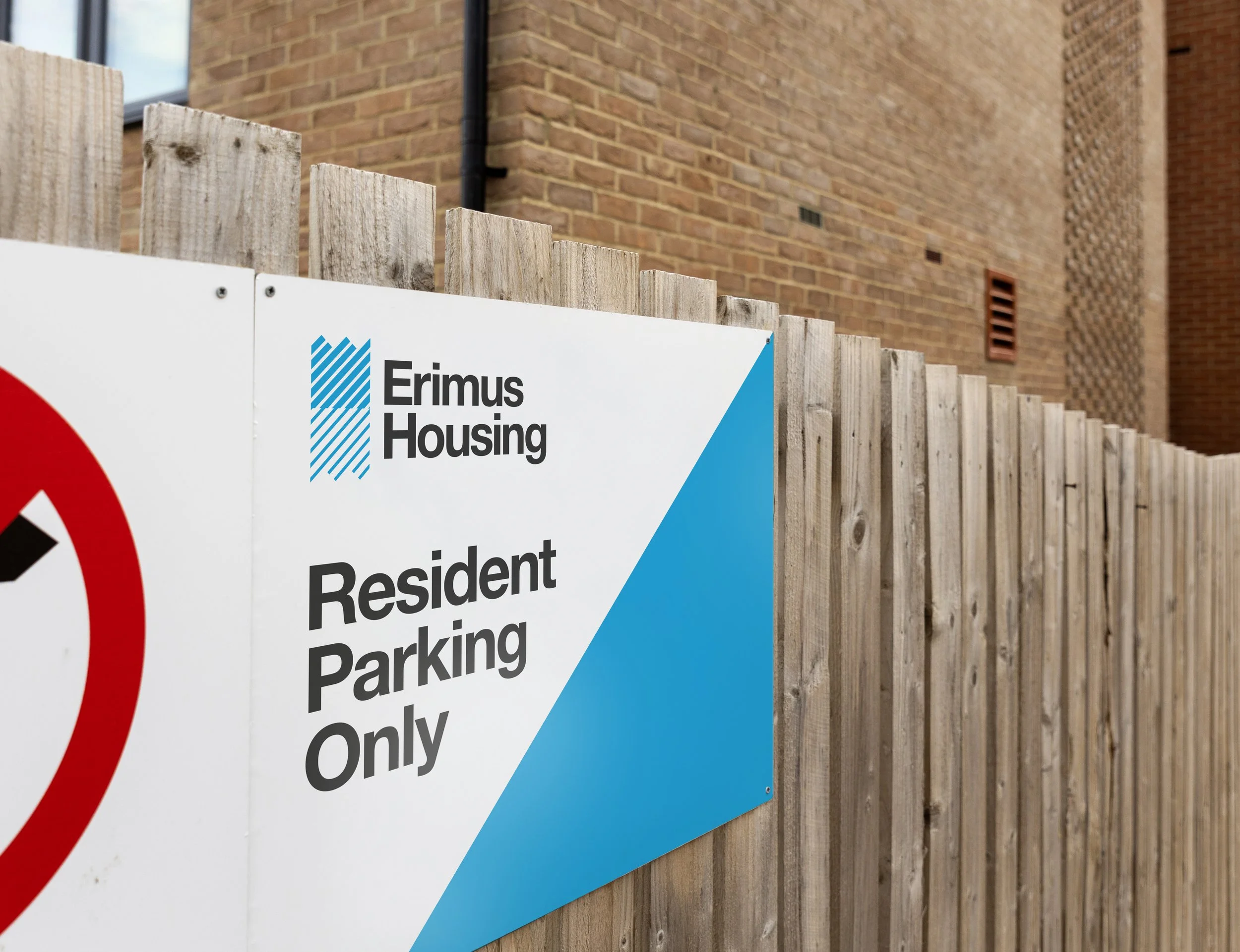
As Fabrick was the main parent group brand, there was a need for a style to be utilised by the operating companies. A logo style was developed to rebrand the existing housing associations of Tees Valley and Erimus Housing and which could allow for other acquisitions to be easily brought in line. Each business took on a colour from the main palette and utilised a symbol derived from the parent ‘weave’. Text was set in clean, legible typeface taken from the parent brand.
THE CHILDREN