Metro student
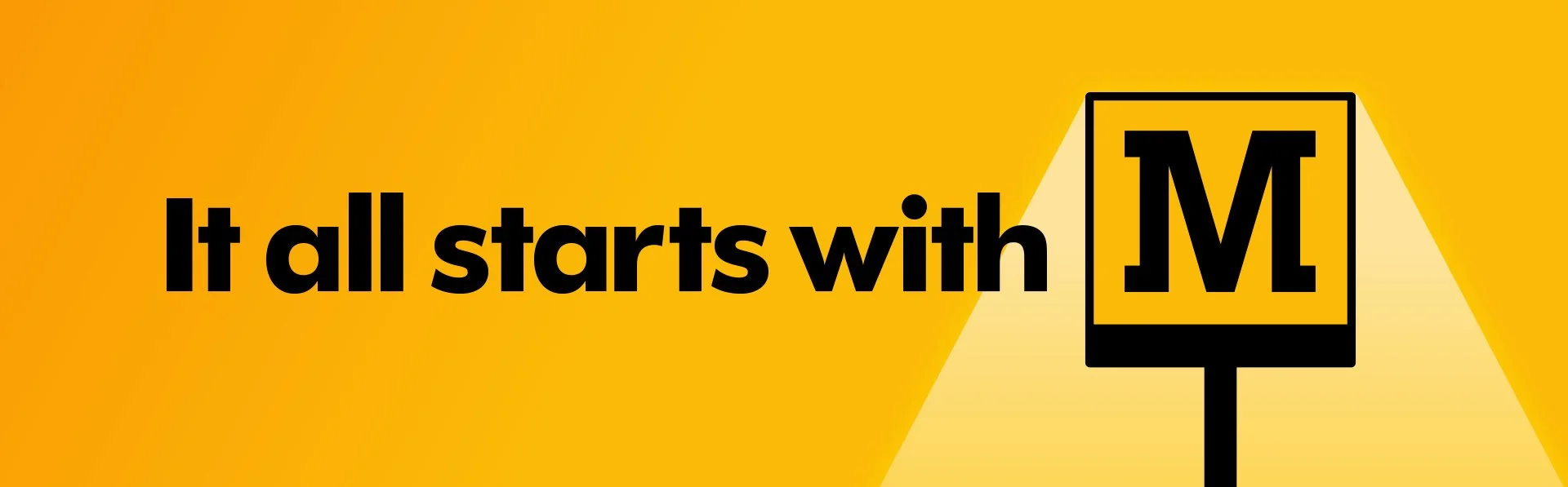
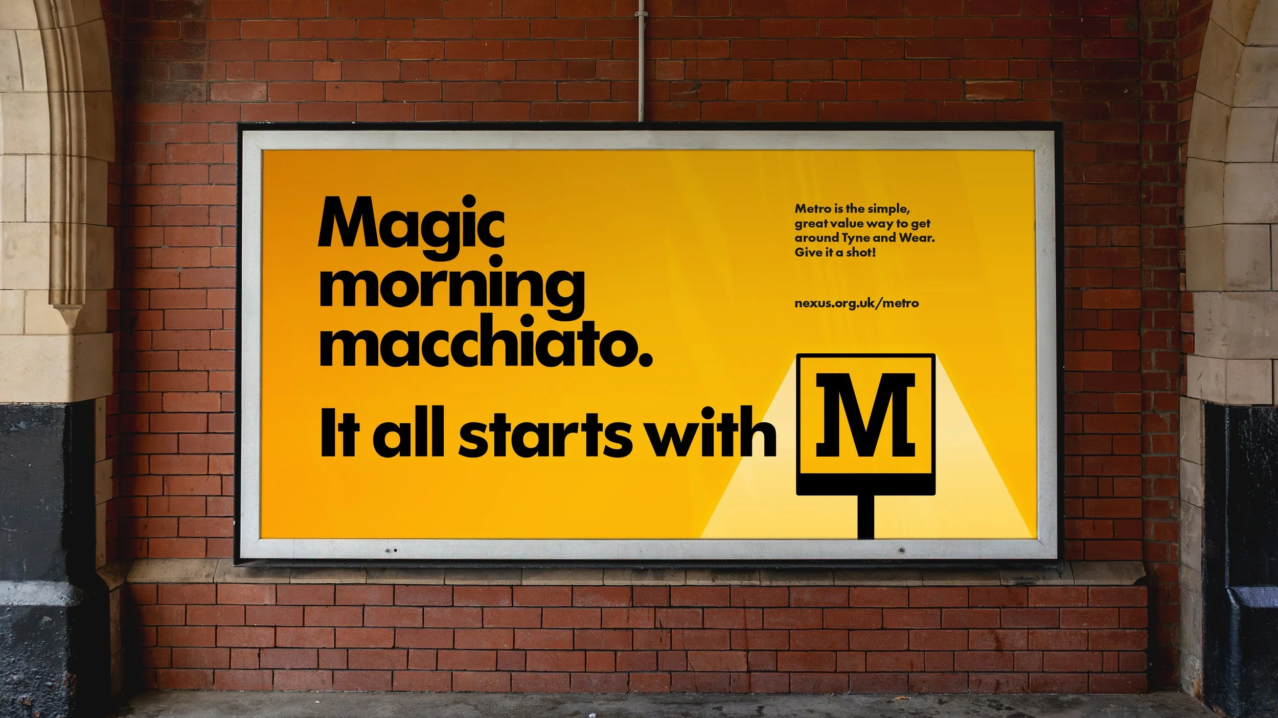
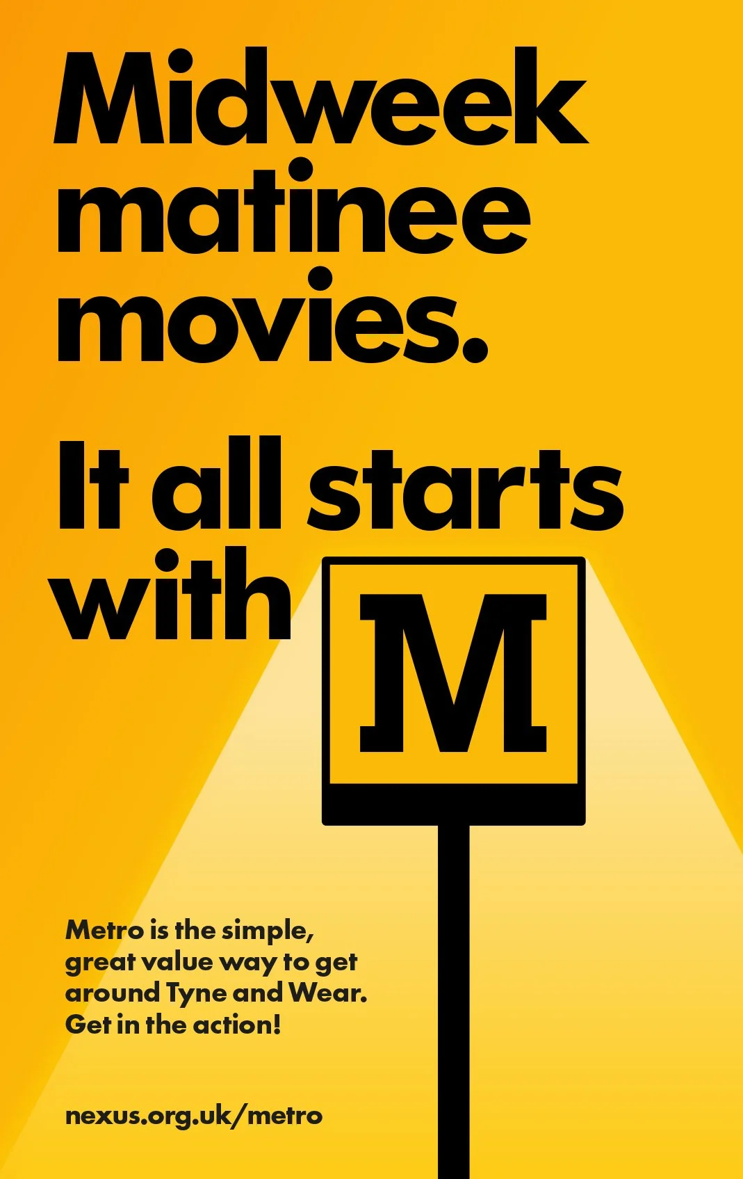
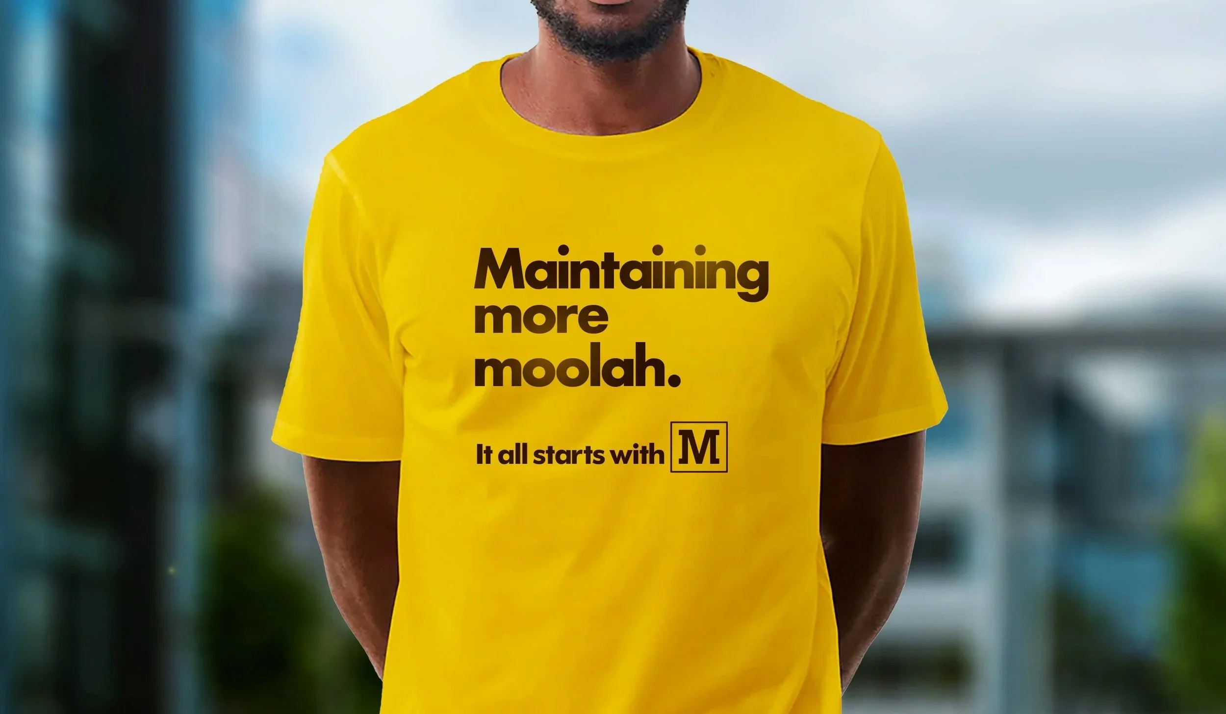
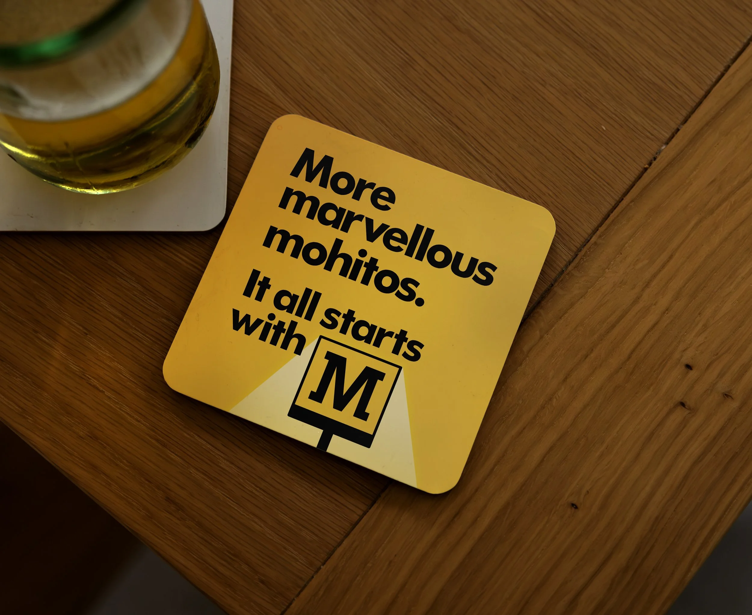
When asked to create an awareness campaign aimed at students the plan was to keep it simple and memorable. The Metro system in Tyne & Wear has very distinctive cube signs with the ‘M’ from Metro within them. And a well known yellow colour. So, that’s where it started.
The simple, infinitely repeatable idea is to put those elements front and centre and to give the ‘M’ a double meaning. By creating triptic lines with three words starting with the letter ‘m’ the campaign communicates many things that Metro travel facilitates all starting with ‘M’ (or Metro depending on how you read it!).